A new identity for Kasteel van Gaasbeek
Kasteel van Gaasbeek is a castle museum on the edge of Brussels. Its own brief named a double identity: a historic house with a rich past on one side, and a living meeting place — a heritage laboratory — on the other. The identity had to hold both at once.
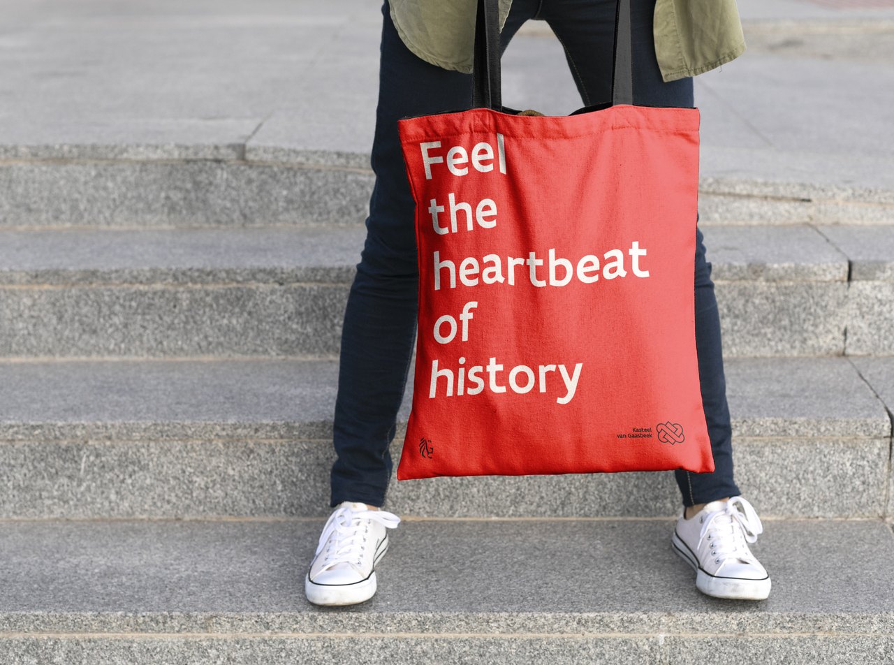
The baseline came from an unexpected place. Karl Ove Knausgård praised the historian Orlando Figes for bringing distant history “so close that you could feel its heartbeat”. That one line became Feel the heartbeat of history, and the whole identity hangs from it.
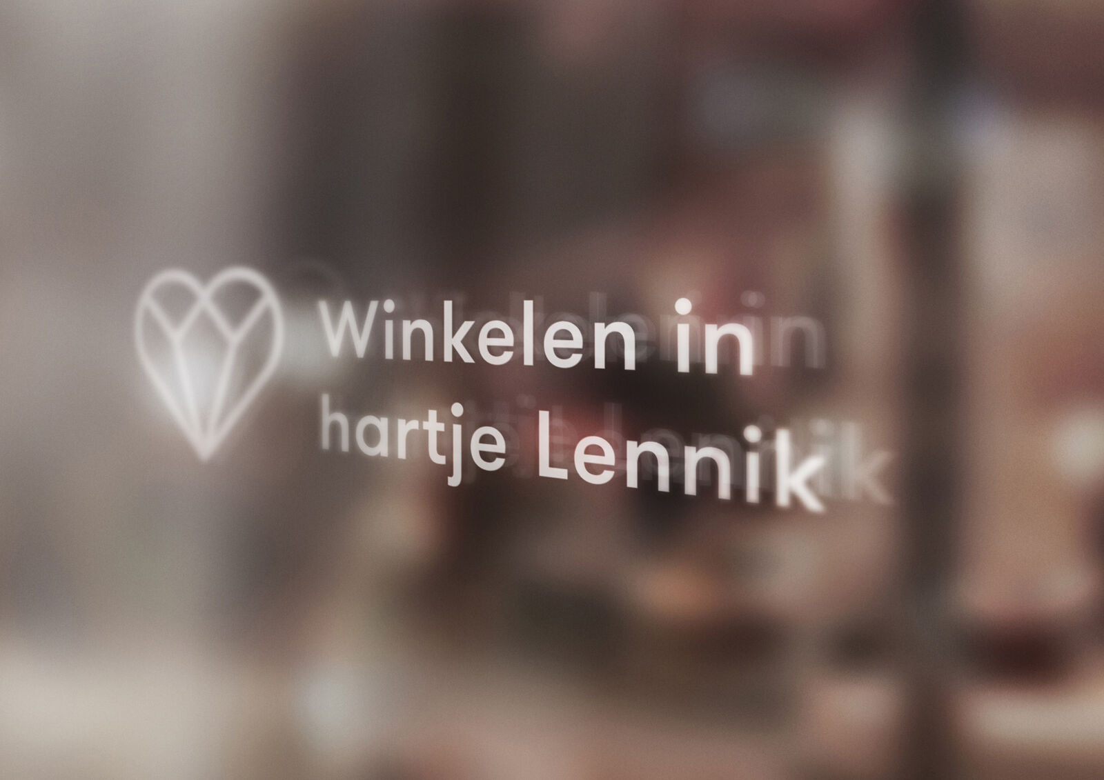
The logo is two hearts woven into one another: the past and the present feeding each other without end. Look again and you find the towers of the castle in the same shape. What follows is how it got there, step by step.
client
Kasteel van Gaasbeek
Vlaamse overheid
year
2024 — ongoing
disciplines
branding, identity,
art direction, typography







The very first presentation of the basic idea. On the left, the symbol Gaasbeek had been using. On the right, the studies that rebuild it into the K of Kasteel on the same square grid — from a closed plane, through the grid, to a letter.
The biscione, the snake from the Arconati Visconti family crest — the Milanese family whose last marquise gave the castle to the Belgian state. Throwing it out was never an option. Every version here is the same line, knotted differently, and each one had to read at the size of a stamp as well as on a facade.









The mark that stayed. Two hearts woven into one another — the past and the present feeding each other without end — built on the same square grid, and echoing the towers of the castle. The biscione was not thrown out with the bathwater: it lives on beside it, as a contemporary extension of the basic logo.